-
Architects: Hito.lt
- Area: 150 m²
- Year: 2018
-
Photographs:Leonas Garbacauskas
-
Manufacturers: Alberta “Pitagora”, Concrete, Florim, Steel
-
Lead Architects: Sigita Kundrotaite-Savicke

Text description provided by the architects. In a departure from the conventional practice, a 5-person family was moving from a suburban house to an old town apartment.
The authors of the project were fascinated by the fresh approach of the clients who believe that home is inhabited by people, stories and experiences, and not by things. Thus, their key objective was to live in a ‘minimalist’ fashion – in terms of style as well as in terms of the amount of material things.

The wishes of the clients were also very few:
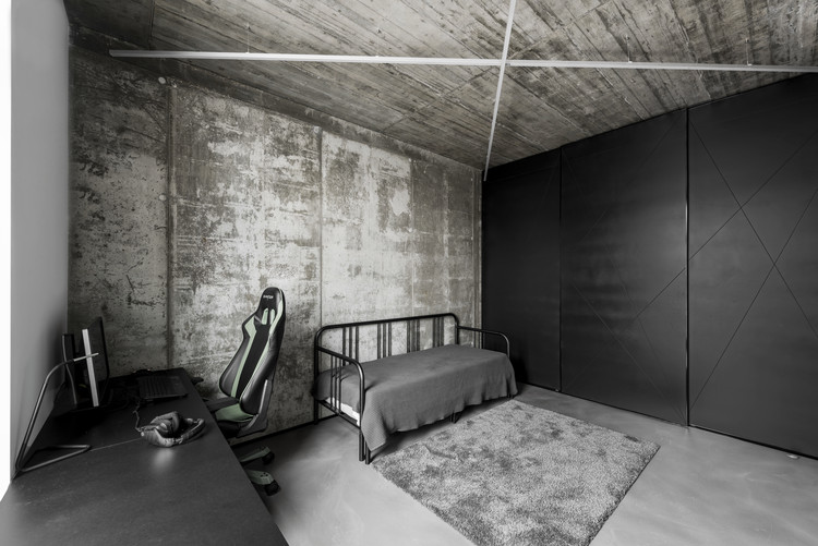
- 4 separate bedrooms
- A spacious common living area
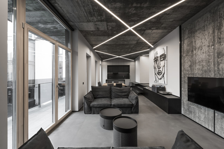
- Unfinished concrete walls and ceilings


The key task for the authors of the project was to design a fully functional plan and to preserve as well as to emphasise the existing advantages of the space where people are playing the central role.

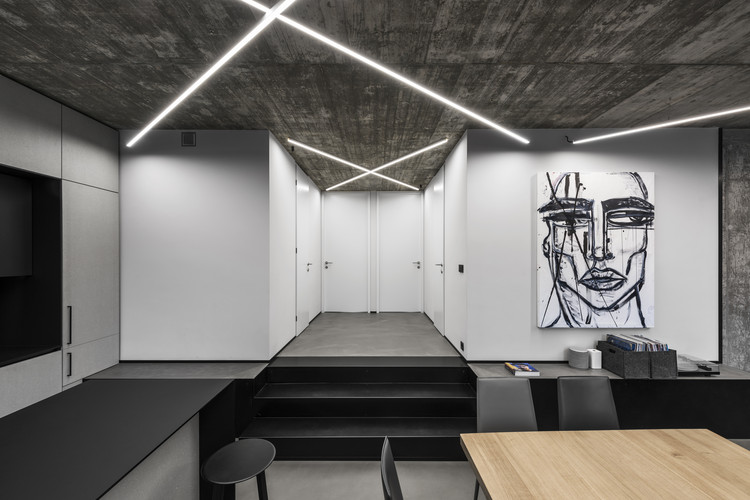
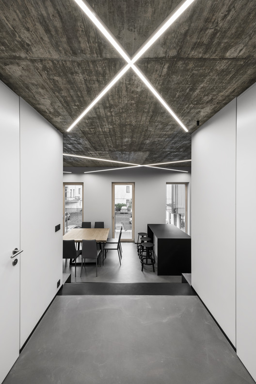
The structure of the plan is dominated by symmetry and neatness. The spaces surround the stairwell as if turning life in a circle. The 150-square-metre apartment has three children’s rooms, one bedroom, one combined kitchen and living room, 2 bathrooms, and a closet.

The central idea of the modern interior was to preserve purity and to leave as many of the existing engineering solutions as possible replacing and/or covering only the essential planes. The apartment is dominated by subtle monochromatic colours and as much natural materials as possible, such as metal, wool, wood, and concrete. There is a lot of black colour in the interior which creates an impression of depth, acts as a leveller, and absorbs certain details. It ‘cuts’ the grey space into different zones and forms spatial structure.

The entire apartment has a unique lighting system adjusted to the room height. It creates a network and gives the space integrity.
As a contrast to rough concrete the visualisation of the marble motif was chosen for the bathroom. Sterile and clean large tiles create a clear division and ‘inform’ the onlooker about their function.

The living area features two pieces of art that are very different from each other in terms of style and stroke of the brush. One of them is a female portrait Her by Gia Ram, which in the architects’ opinion converses with the rough and fluent concrete structures of the walls. The other – Chromatic Aberrations by Tadao Cern – is very geometric and clear and communicates with the rigorous shapes and elements of the apartment space. This emphasises the two sides of the interior – the free, rough and expressive, and the structural, subtle, geometric, minimal and hypnotising.


